Soft, calming and quietly elegant, lavender colour is one of the most versatile shades in the purple family. It can make a bedroom feel peaceful, give a website a gentle modern appearance or add a romantic touch to an outfit.
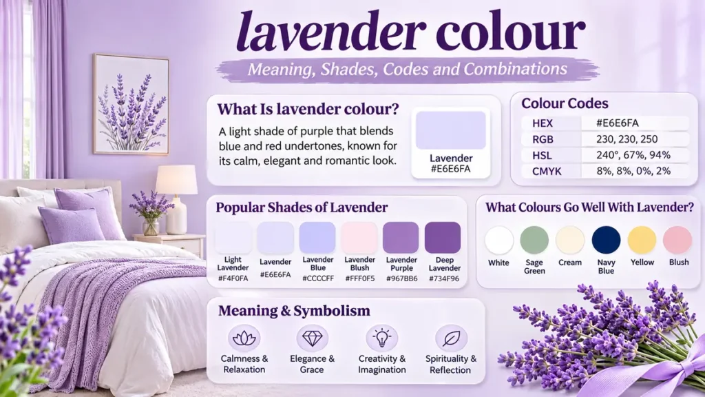
Lavender colour is a light shade of purple that blends blue and red undertones with a soft, pale appearance. Named after the lavender flower, it is associated with calmness, elegance, creativity and romance. The commonly used digital lavender shade has the HEX code #E6E6FA, although other variations can appear pinker, bluer or more saturated.
Lavender
#E6E6FA
Standard CSS lavender colour, shown as a digital colour swatch.
What Is lavender colour?
Lavender is a pale purple colour named after the flowers of the lavender plant, particularly species within the genus Lavandula. Its appearance sits between delicate violet and muted lilac, although the exact tone depends on the colour system, material and lighting.
In digital design, lavender is also a standardized CSS named colour. The name lavender corresponds to HEX #E6E6FA, a very light, slightly bluish purple.
However, the colour of natural lavender flowers varies considerably. Some blooms appear bluish violet, others are pinkish purple, and some cultivated varieties have almost white flowers.
Is lavender purple or pink?
Lavender belongs to the purple colour family, but some variations have noticeable pink undertones.
Purple is created by combining red and blue light in digital colour systems, while paint mixtures behave differently because pigments absorb and reflect light. Adding white pigment to a purple paint mixture generally produces a lighter tint.
The balance of red and blue influences whether a lavender shade appears warmer or cooler.
Is lavender a warm or cool colour?
Lavender is generally considered a cool colour, especially when blue undertones dominate. Pinkish lavender can feel warmer, making it suitable for romantic and welcoming colour palettes.
The surrounding colours also affect perception. Lavender beside navy may appear delicate and warm, while the same shade beside peach can seem noticeably cooler.
Lavender Colour Codes: HEX, RGB, HSL and CMYK
Colour codes help designers reproduce consistent shades across websites, illustrations, branding materials and printed projects.
The standard CSS lavender colour uses these values:
| Colour format | Value |
|---|---|
| HEX | #E6E6FA |
| RGB | 230, 230, 250 |
| HSL | 240°, 67%, 94% |
| HSV | 240°, 8%, 98% |
| CMYK (approximate) | 8%, 8%, 0%, 2% |
CMYK values are approximate conversions. Actual print results depend on the printer, ink, paper and ICC colour profile.
How to use lavender in CSS
A web designer can apply the named CSS colour directly:
.lavender-background {
  background-color: lavender;
  color: #302847;
}

.lavender-heading {
  color: #70579A;
}
The named colour and HEX value #E6E6FA represent the same standard sRGB colour.
For consistent web presentation, designers should test lavender alongside text colours that provide sufficient contrast. Very light lavender backgrounds generally need dark text rather than white text.
Popular Shades of Lavender
Lavender is not a single fixed appearance outside standardized colour systems. Its variations range from nearly white pastels to richer violet tones.
Light Lavender
#F4F0FA
Copy
Lavender
#E6E6FA
Copy
Lavender Blue
#CCCCFF
Copy
Lavender Blush
#FFF0F5
Copy
Lavender Purple
#967BB6
Copy
Deep Lavender
#734F96
Copy
Representative digital shades. Some shade names are descriptive rather than universally standardized.
Light lavender
Light lavender has a delicate, airy appearance. It works well on bedroom walls, stationery, website backgrounds and decorative textiles.
Its low visual intensity makes it useful in spaces where a stronger purple would feel overwhelming.
Lavender blue
Lavender blue combines the softness of lavender with a more pronounced blue influence. It often feels cooler and slightly more restrained than pinkish lavender.
This shade works particularly well with white, slate grey, navy and pale silver.
Lavender blush
Lavender blush is an extremely pale, pink-tinted shade associated with softness and romance. It is commonly used in wedding palettes, feminine-inspired illustrations and delicate interior schemes.
Unlike traditional lavender, it leans strongly toward the pink side of the spectrum.
Lavender purple
Lavender purple is richer and more saturated than standard CSS lavender. It can be used for accent walls, decorative cushions, illustration elements and branding.
Because it has greater colour intensity, it generally attracts more attention than pale lavender.
Deep lavender
Deep lavender approaches muted violet or medium purple. It creates stronger contrast against cream and pale neutral backgrounds.
It is particularly useful when designers want the character of lavender without the extremely light appearance of a pastel.
What Does Lavender Colour Symbolize?
Lavender is associated with several emotional and cultural meanings, including tranquility, romance, grace and imagination.
These associations are symbolic rather than universal psychological effects. Individual responses to colour can vary according to personal experiences, cultural background and context.
Calmness and relaxation
Pale lavender is frequently used in bedrooms, wellness environments and meditation-inspired designs because its gentle appearance can contribute to a restful visual atmosphere.
The calming association is also influenced by the lavender plant, whose fragrance is commonly connected with relaxation. The visual colour and the plant’s scent are separate sensory experiences, however.
Elegance and femininity
Lavender often communicates understated elegance. Its softness makes it popular in wedding decorations, fashion accessories, floral arrangements and personal stationery.
Although traditionally associated with femininity in some design contexts, lavender is not inherently gender-specific.
Creativity and imagination
Purple has long been associated with imagination, mystery and artistic expression. Lavender offers a lighter interpretation of those associations.
It can make creative projects feel imaginative without appearing as dramatic as deep violet or royal purple.
Spirituality and reflection
In some spiritual and artistic traditions, pale purple shades symbolize introspection, sensitivity and contemplation.
These interpretations depend on cultural and personal beliefs rather than a fixed meaning shared by everyone.
What Colours Go Well With Lavender?
Lavender works with a surprisingly broad range of colours. The most successful combinations balance its cool, delicate character with neutrals, natural greens or contrasting warm tones.
Lavender + White
Clean and airy
Lavender + Sage
Natural and soothing
Lavender + Cream
Soft and welcoming
Lavender + Navy
Elegant and defined
Lavender + Yellow
Fresh and cheerful
Lavender + Blush
Romantic and gentle
Lavender and white
White highlights lavender’s lightness, creating a clean and open appearance. This combination suits minimalist bedrooms, bathrooms, stationery and modern website layouts.
Warm white produces a softer result, while brilliant white creates a crisper contrast.
Lavender and sage green
Sage green brings an earthy quality to lavender. Because the colours resemble combinations found in gardens, they can create a balanced botanical palette.
This pairing works especially well with natural wood, linen, cream and muted brass accents.
Lavender and grey
Grey can make lavender look more sophisticated and restrained. Pale grey creates a subtle, low-contrast scheme, while charcoal adds definition.
For a balanced interior, use lavender on a feature wall or upholstery and grey on larger surrounding surfaces.
Lavender and yellow
Yellow sits opposite blue-violet hues on the traditional colour wheel, making it a useful contrasting partner for lavender.
Soft butter yellow provides a cheerful pastel combination, while mustard or golden yellow creates a stronger visual accent.
Lavender and navy blue
Navy blue gives pale lavender visual weight. This combination is effective in bedrooms, formal clothing, branding and digital interfaces.
Navy also provides stronger contrast than other pastel colours, which can improve readability in appropriately designed layouts.
Interior design references from Architectural Digest and Livingetc also illustrate lavender alongside greens, blues, warm neutrals and stronger accent colours. Livingetc+1
Lavender vs Lilac, Mauve, Violet and Periwinkle
Lavender is often confused with other pale purple shades. Their differences become easier to understand by comparing undertones, saturation and lightness.
| Colour | Typical HEX | Main characteristic |
|---|---|---|
| Lavender | #E6E6FA | Very pale, cool purple |
| Lilac | #C8A2C8 | Pinkish light purple |
| Mauve | #E0B0FF | Pale purple with pink influence |
| Violet | #EE82EE | Brighter, more saturated purple |
| Periwinkle | #CCCCFF | Soft blue-violet |
| Thistle | #D8BFD8 | Muted, greyish purple |
These values represent selected digital colour references, not every variation sold under each name.
Lavender vs lilac: What’s the difference?
Lavender generally leans toward blue, whereas lilac usually has stronger pink undertones.
The standard lavender web colour is also lighter than the commonly referenced lilac shade. However, floral lavender and commercial paint shades can be darker or more saturated.
Lilac often suits warmer, romantic palettes, while cool lavender works particularly well with silver, navy and blue-grey.
Lavender vs mauve
Mauve can refer to several purple tones, but it often appears more pinkish or muted than lavender. Historical mauve dyes and modern digital mauve shades do not necessarily share identical colour coordinates.
In interior design, dusty mauve can create a more vintage appearance, whereas pale lavender usually feels lighter and airier.
Lavender vs violet
Violet is generally more vivid and saturated than pale lavender. The term also refers to the short-wavelength end of the visible spectrum, although the CSS colour named violet is a specific pinkish-purple digital shade.
Lavender is often more practical for large backgrounds because it has lower visual intensity.
Lavender vs periwinkle
Periwinkle is a blue-violet shade that can look noticeably bluer than many floral lavender tones.
However, standard CSS lavender and the commonly used periwinkle reference #CCCCFF share the same HSL hue angle. Their apparent differences arise largely from saturation and lightness. Hue Alchemy+1
How to Use lavender colour in Interior Design
Lavender can work in modern, traditional, minimalist and cottage-inspired interiors. The key is selecting the right undertone and deciding how much of the room it should occupy.
Lavender : 2070-60 : benjamin-moore : Color Inspiration and Exploration 🦊
Revestimento Aquarela Lavanda Mate Esmatado Bold 7,0×25,0 – Decortiles Piso – Revest Acabamentos
12
Lavender bedroom walls
Light lavender walls can create a gentle, restful atmosphere, particularly when combined with cream bedding, white curtains and natural wood furniture.
A cooler lavender can make a sunlit room feel visually fresh. In a room with limited natural light, a warmer lavender with pink undertones may feel more welcoming.
Before painting an entire bedroom, test sample patches on different walls. Observe them during daylight and under artificial lighting because their appearance can change significantly.
Lavender living room ideas
In a living room, lavender works as either a primary background or an accent colour.
A lavender sofa against off-white walls can become a soft focal point. Alternatively, lavender cushions, artwork and throws can introduce colour without requiring permanent changes.
Pairing lavender with dark wood or charcoal furniture helps prevent an overly pastel appearance.
Lavender bathrooms and kitchens
Lavender tiles, painted cabinetry and small accessories can bring subtle colour to kitchens and bathrooms.
For a bathroom, lavender combined with white ceramic surfaces and brushed nickel fixtures creates a fresh, understated look.
In kitchens, muted lavender cabinetry can work with cream countertops, warm wood and brass hardware.
How much lavender should you use in a room?
A useful starting point is the 60-30-10 decorating guideline:
- 60% dominant colour, such as cream or warm white.
- 30% secondary colour, such as lavender.
- 10% accent colour, such as sage, navy or muted gold.
This is a flexible design principle, not a strict formula. The ideal balance depends on room size, lighting, furniture and personal preference.
Lavender Colour in Fashion, Weddings and Graphic Design
Lavender’s versatility extends beyond home decoration. Its soft appearance allows it to function as a main colour, supporting tone or subtle accent.
Lavender outfits and clothing combinations
Lavender clothing can look casual, polished or formal depending on the fabric and accompanying colours.
For everyday wear, lavender pairs naturally with white, denim blue, beige and light grey. For a more dramatic outfit, charcoal, navy or deep plum provides contrast.
A lavender shirt with navy trousers creates a balanced appearance, while a lavender dress with neutral accessories produces a softer look.
Metallic silver accessories tend to reinforce cooler lavender tones. Gold accessories can introduce warmth, particularly with pinkish lavender.
Lavender wedding colour palettes
Lavender is a popular choice for spring and summer wedding styling because it combines naturally with floral arrangements and pale neutrals.
2025 Wedding Colors: Trends, Palettes, and Perfect Hues for Your Big Day – LavandaMichelle
Wedding Prom Bouquet Sage Lavender White – Add Groom Boutonniere Matching Corsage & More! – Etsy
14
Popular combinations include lavender with sage green, ivory, dusty rose and champagne.
Lavender can appear in bridesmaid dresses, invitations, table linens, ribbons and flower arrangements. Using several tones from the same colour family can create visual depth without making the overall palette too busy.
Lavender in logos and branding
Lavender is often used in beauty, wellness, lifestyle, creative and personal-care branding.
Its visual associations can communicate softness, approachability and imagination. However, a colour alone cannot establish a brand’s personality; typography, imagery, messaging and surrounding colours are equally influential.
For a digital brand identity, designers might combine a pale lavender background with deep purple headings and charcoal body text.
Lavender in website and UI design
Pale lavender works well as a background for informational cards, navigation highlights, illustrations and selected interface elements.
Because #E6E6FA is extremely light, white text on it has insufficient contrast for normal accessibility requirements. Black text provides a contrast ratio of approximately 17.06:1, making it substantially easier to read. MDN+1
For accessibility, the World Wide Web Consortium (W3C) Web Content Accessibility Guidelines generally require a minimum contrast ratio of 4.5:1 for normal text and 3:1 for large text at Level AA.
Designers should calculate contrast for the actual foreground and background colours rather than relying on visual appearance alone.
How to Make Lavender Colour
Lavender can be created through pigment mixing or digital colour selection, but these methods work differently.
Mixing lavender with paint
For a basic lavender paint mixture:
- Start with a small quantity of purple paint.
- Gradually add white paint to lighten the colour.
- If the result looks too pink, introduce a tiny amount of blue.
- Mix thoroughly and test the colour on a sample surface.
- Allow the sample to dry before judging its final appearance.
Different pigments have different tinting strengths, so exact proportions vary by paint brand and formulation.
Using a violet pigment with white can produce a cleaner lavender than mixing certain red and blue paints, which may create a dull or greyish purple.
Creating lavender digitally
Digital lavender is represented by numerical colour values rather than physical pigments.
For the standard CSS colour, enter #E6E6FA in a colour picker.
In RGB, this corresponds to 230 red, 230 green and 250 blue on a scale from 0 to 255.
Designers can then adjust lightness and saturation using tools such as Adobe Photoshop, Figma or Canva.
When creating multiple variations, save their HEX codes in a shared palette to maintain consistency.
How to Choose the Right Lavender Shade
Choosing lavender involves more than finding an attractive swatch. Lighting, undertones, surrounding materials and intended use all affect the final result.
Check the undertone
Compare a lavender sample against a neutral white background.
If it appears noticeably blue, it is likely a cooler lavender. If it looks pinkish, it may be closer to lilac.
This distinction helps when selecting matching fabrics, wall paints and digital accent colours.
Consider lighting and materials
Paint colours can appear different under warm LED lighting, cool daylight or shaded conditions.
Fabric texture also affects colour perception. Velvet, cotton, satin and matte-painted surfaces may reflect light differently even when their nominal colour values are similar.
For physical products, evaluate actual material samples whenever possible.
Avoid common lavender colour mistakes
One common mistake is combining too many pale colours without a darker element to create definition.
Another is assuming that every product described as lavender will match the standard digital shade. Manufacturers often use the name for substantially different purple tones.
Finally, avoid choosing text colours based solely on aesthetics. Lavender may look attractive in a design while failing accessibility contrast requirements.
Why Lavender Colour Remains Popular
Lavender offers a distinctive balance between the expressiveness of purple and the subtlety of pastel colours.
It can be gentle without looking plain, decorative without becoming overwhelming and colourful without demanding constant attention.
Its adaptability explains why it appears in fashion, interior decoration, floral design, digital products and visual identities.
The colour also connects naturally with botanical imagery, seasonal palettes and soft modern aesthetics. Designers can change its character considerably simply by pairing it with different neutrals or accent colours.
Final Thoughts on lavender colour
Lavender colour is a pale, versatile purple associated with softness, elegance and creativity. The standard CSS shade is #E6E6FA, but the wider lavender family includes bluish, pinkish, muted and deeper purple variations.
For a peaceful look, pair lavender with cream, white or sage green. For stronger contrast, use navy, charcoal or golden yellow. When working with paint, textiles or digital interfaces, pay particular attention to undertones, lighting and readability.
The best way to use lavender is to select a specific shade, test it in its intended setting and build a balanced palette around it.